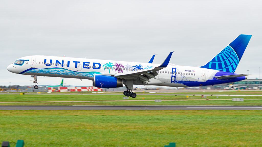
The evolution of United Airlines logos parallels the airline’s rich history, reflecting shifting design trends and branding strategies over the decades. From humble beginnings in the early 20th century to the modern era of corporate mergers, each iteration of the United logo tells a story of innovation and adaptation.
Early Logos and Shield Designs
United Airlines’ inaugural logos in the 1930s featured simple, rectangular designs with variations in color schemes. The introduction of shield or crest designs in the late 1930s marked a significant departure, incorporating patriotic motifs such as the silhouette of the United States. These logos evolved, with iterations featuring wings and alternating color palettes.
Transition to the Spike Design
In the 1960s, United Airlines adopted the iconic spike design, characterized by the prominent display of the airline name alongside bold, angular spikes. This era saw experimentation with font styles and livery designs, culminating in the introduction of the “Stars and Bars” livery in the late 1960s.
The Tulip Design by Saul Bass
A pivotal moment in United Airlines‘ branding came in 1974 with the commissioning of graphic designer Saul Bass to create a new logo. The resulting “tulip” design, featuring overlapping red and blue letters forming a stylized “U,” heralded a new era of consistency and recognition for the airline’s brand identity.
Subsequent Logo Refreshes
In the years following Bass’ design, United Airlines underwent periodic logo refreshes, maintaining the tulip motif while adjusting its presentation and accompanying typography. From the battleship gray livery of the 1990s to the “Rising Blue” livery of the early 2000s, each iteration reflected contemporary design sensibilities.
Merger and Modernization
The merger of United Airlines with Continental Airlines in 2010 precipitated another logo overhaul, integrating elements of Continental’s iconic globe design into United’s visual identity. The transition marked a departure from the tulip logo that had defined the airline for decades, signaling a new chapter in its branding evolution.
Conclusion
The evolution of United Airlines logos encapsulates a journey of innovation and adaptation, mirroring the airline’s enduring legacy in the aviation industry. From humble beginnings to global mergers, each logo iteration reflects the spirit of progress and transformation that defines United Airlines’ identity.

